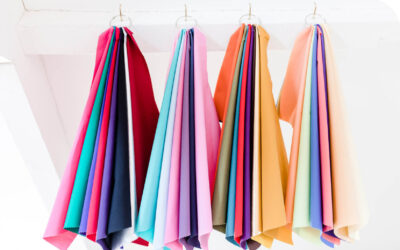
We all have a favourite colour. If I were to peek inside your wardrobe or your home, there would be the repeated flash of a particular colour that has captured your heart. For some it may be one specific shade, tint, or tone that you’ve embraced such as pillar box red or duck egg blue. For others it’s a particular hue, red, blue or green and there’ll be layers of different tones blending together.
If asked, my friends would probably say mine was blue, particularly those who’ve been shopping with me. Like a moth to light, I home in on anything from bright turquoise to a deep ocean teal ????. Having been bought up by the sea I’d always assumed this love came from many hours spent on beaches watching the waves crash on the shore and, by wearing blue, I’d put myself back in that happy place. Sometimes it did just that but on other occasions, the same effect just wasn’t there, and I was left feeling blah. So why then, didn’t wearing blue always make me happy?
Psychological reaction to colour
Well, the first piece of the jigsaw is that scientific research has established that different colours have different psychological effects. When we see colour, the light that enters our eyes sends electrical impulses to our brain that deciphers those impulses and tells us what we are seeing. This may seem quite straight forward, but the key is that those impulses also pass through the part of our brain that processes emotions. So, whether we like it or not, we have a psychological reaction to every colour we see.
Each primary colour has a specific impact
Scientists have monitored those reactions and our bodies respond to the primary colours in very specific ways.
- Red triggers a physical response. Our heart and pulse rate increase, activating our instinctive flight or fight reaction.
- Yellow triggers an emotional response. It impacts the nervous system which sends messages from the brain to our bodies.
- Blue triggers a mental response. It affects our intellect, gets us thinking.
- Green is also important from a psychological perspective. Sitting at the centre of the rainbow, it’s a harmonious colour balancing our mind, body and emotions. Just consider the positive calming effects we feel from taking a walk in nature and you’ll realise how true this is.
Psychology of the main colours
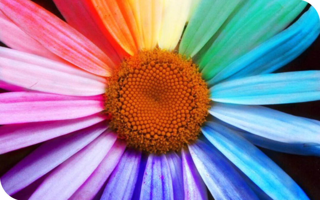
Incredibly, research has identified 16 million different colours in our world. As I’m not sure I’d be able to see the difference between them all, I’m going to focus on the psychology of the main eleven colours.
How light or deep a colour is will influence whether we find it soothing or stimulating and it’s important to note that all colours have both positive and negative qualities depending on the how they are used.

Red
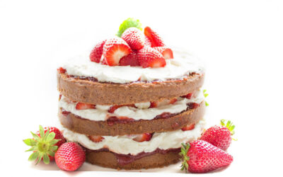
As the colour to impact us physically, red is the colour of energy and excitement. It has the longest wavelength and will look nearer than it is. So, if you want to stand out, it’s a colour to get you noticed. Widely perceived as the colour of love and lust, on the negative side, too much red can come across as shouty or aggressive.

Pink
Pink is nurturing, caring and the colour of empathetic love which is why it’s great to help you feel better about yourself. Use a deeper, stronger pink like a fuchsia or magenta and it’ll be significantly more stimulating. In business, a recent trend for women wanting to create impact, has seen a switch from masculine red, to a more feminine but still feisty strong pink.

Yellow
Impacting our emotions, yellow is stimulating and can help us feel confident, positive and optimistic. Just think about how uplifted we feel when the sun is shining. However, combine it with black and we may become more wary; wasps and the markings on some snakes for example.

Orange
Combining positive elements from both red and yellow, orange is warm and energetic. It’s a colour which is playful, sometimes mischievous and very sociable. A great choice if you want to engage others in friendly conversation.

Brown
Think of trees and soil and that will give you a hint of the psychological impact of brown. It’s a strong, earthy colour that helps us feel grounded. The warm and rich tones of autumn can make us feel safe and cosy, although too much can be heavy and oppressive.

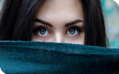
Blue
The colour that impacts us mentally, blue gets us thinking. Deeper tones give us focus, help us think logically and is often called the colour of communication. Lighter tones provide calm, soothe us and aid reflection. Too much blue and too much thinking may mean we fail to interact with others, possibly appearing cold and aloof.

Green
The colour of balance and harmony, green can be seen around us every day in nature and instinctively reassures us. This may be why some dementia units in hospitals and care homes have started to introduce green interiors, to help soothe and bring tranquillity to their patients. Green is the colour that has the most variety of tones ranging from zingy, upbeat lime to the darker, heavier olive.

Purple
The colour with the shortest wavelengths, purple is the last colour we see which may explain its connection to a higher realm and a universe beyond ours. Originally a difficult and expensive colour to produce, it was used by royalty and the church to demonstrate status. Still linked to spiritual awareness it can help restore peace from chaos, particularly those dealing with grief or depression.

Grey
If you think about grey days you can understand why pure grey doesn’t have any positive psychological qualities. It’s surprising therefore to see the recent trend for grey interiors. Maybe people want to use it to drown out the noise of everyday life, a kind of sanctuary. It’s true that grey can work as a great neutral background to set off pops of brighter colour but too much of it can be draining.

White
Traditionally seen as pure, simplistic and tranquil, white was thought to be calming and was used in psychiatric hospitals to reduce emotional responses. However, it’s also cold and sterile and could leave patients feeling alone and worried. That’s why white, in its many guises, ivory, oyster, cream for example, is best contrasting with other colours in a cohesive look.

Black
Black has many psychological traits. For some it means elegance and glamour, for others it’s authority and seriousness. As a colour black gives no reflection, it absorbs all light which is why some people chose to hide behind it. It’s another colour best combined with others, otherwise it can be cold, oppressive and draining.
So, without us realising it, the colours we wear can have significant impact on our mood and how we feel. When I was wearing blue thinking it would make me feel happy, perhaps I actually needed more energy or a little self love on those days and would have felt better wearing a red jumper or reaching for a softer pink scarf.
Select tones to harmonise with the natural you
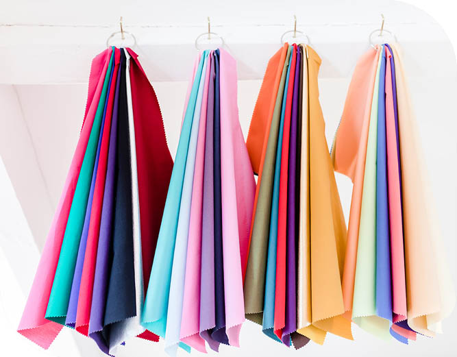
The final piece of the jigsaw, to sit alongside the psychological impact, is identifying the tone of those colours that work cohesively with your own natural skin tone, eyes and hair. To know which palette of colours you belong to is incredibly uplifting. It means you instinctively gel with those colours and they will feel like you. We all have either a warm or a cool undertone to our skin and choosing clothes in the right colours will make your skin glow and eyes sparkle. You will actually look younger and you’ll feel better too!
If you’d like to learn about seasonal colour analysis and find out which colours will give your spirits a lift, give me a ring to find out more.

If you enjoyed this, read on for further inspiration.

Travel light & dress fabulously with a versatile capsule wardrobe
Riding a motorbike,...
Add accessories & take your outfit from ‘so-so’ to super stylish!
This month I'm looking...
Create your individual style by adding pattern & print to your outfit
Do you prefer to keep...

Video calls – tips to present yourself well, feel confident and gain engagement!
Even with a little...
The secret recipe for combining your colours in a ‘put together’ look!
Do you worry about...

Declutter your Wardrobe to Discover what Suits You and Your Lifestyle!
Getting dressed is...
Colour Analysis – what is it and will it make a difference to how I look and feel?
I’m sure we’ve all had...
Look fab and get wrapped up for winter – great tips on how to tie your scarves
Scarves are one of my...
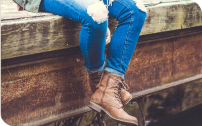
The perfect jeans to suit your body shape and which boots to choose to finish your look
I don’t know about you,...
In challenging times Self-Care is essential – give yourself a Boost with Colour!
‘Self-care’ is any...